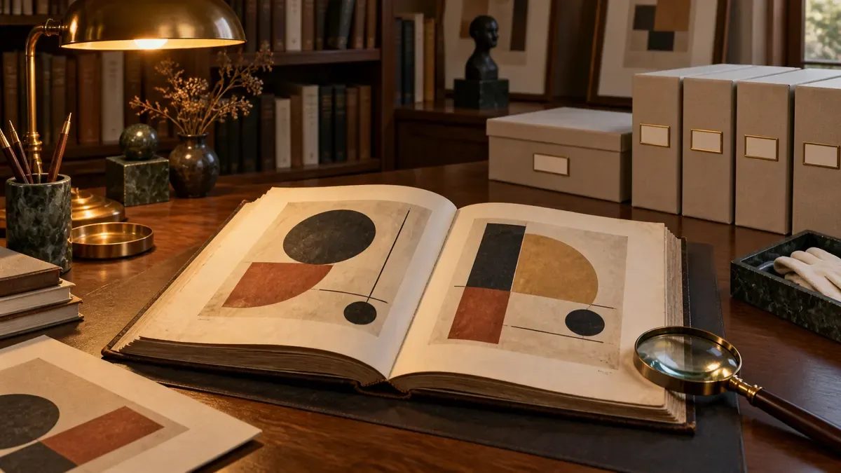

In minimalist design, the goal is to protect the message while reducing the number of items. The decision to simplify should not eliminate the information the reader needs.
Write the information priority first
The event name and date on a poster, option on the product page, and purchase condition may be basic information. Before removing items from the design, determine what decision the reader will make. Mark the repetitions and decorations that do not contribute to this decision. If you put the decoration in the same bag with the necessary information, the result will look clean but useless.
Use the space to describe relationships
Bringing together items belonging to each other, separating different groups, is one of the basic tools of visual order. You don't need to fill in every space; however, the relationship between the tag and description that is too far away can also be lost. When looking at the design, check which items are read together. There should be a decision as conscious as space, text, or line.
Increase the quality of reduced items
When there are few items left, typography, alignment and image quality are more visible. Using a single font does not automatically create consistency; thicknesses, line spacing, and header ratios should be arranged again. Pale text or very fine line can lead you to compromise readability in the name of simplicity. Test the design at the actual size of use.
Compare the two versions over the task
Evaluate the simplified version with the same question with the first draft. Can the user find the basic information, select the right action and differentiate the brand? If the exemplified explanation raises new questions, put it back or move it to a more appropriate location. Minimalism is not a mandatory style for every job; well grouped detail in a project that requires intense knowledge may be more effective than an over-empty page.
Simplicity in marketing is not a lack of knowledge
Highlighting the single message does not mean keeping the conditions necessary for the customer to make a decision. The main word in the campaign visual can remain clear; coverage, samples and conditions should be explained on the target page. Decide which information is understood at first glance in a plain view. If the product name or next step is lost, it is not an advantage alone that the design is under elemental.