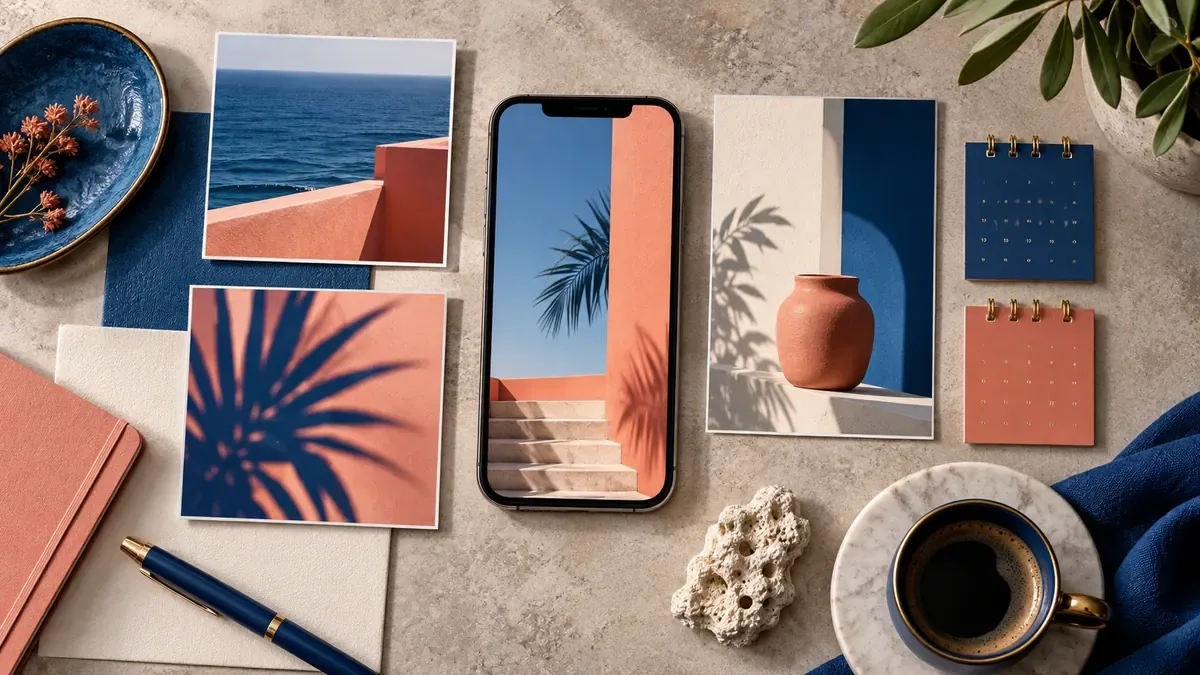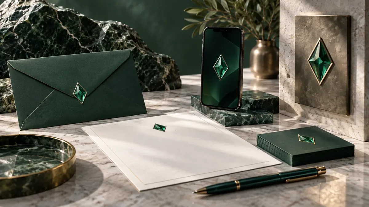
Examine design decisions instead of copying the format while taking advantage of corporate identity examples. The reference board should make the questions to be answered for your brand visible.
Find the rule behind appearance
Do not label the work you like simply as modern, plain or premium. Note concrete preferences such as scale difference between titles and text, space usage, photo direction, and repetitive color ratio. How does the same logo position on different surfaces? How does the layout stretch when a long title comes? These questions allow you to understand the system behind the image.
Test with your own use area
The application weight of the identity prepared for a museum may differ from that of a manufacturer. The fact that the reference looks good does not mean it will work on your proposal document, in your vehicle dress or on your product label. Select your three priority surfaces and consider the outcome of each reference decision on these surfaces. Do not budget for applications that do not need to be used.
Produce decision note instead of similarity
Type in your clipboard what you're looking at under each image: strong typographic contrast, the color system that holds different products together, or the simple hierarchy of information. It's not about learning from the reference to get the exact symbol, the original pattern, or the whole composition of a brand. Rebuild the principles you learn from different sources through your own content and your target audience.
Evaluate the result with recognition
Examine the trials prepared side by side with the visuals of the competitors. Is the remaining language distinguishable when you temporarily remove the logo? Is it also understood that the applications belong to each other? This work does not replace legal brand research; but helps to see visual similarities early. The delivery should include not only sample applications, but also rules of use that allow to produce them.